Color is one of the most influential elements in interior design and architecture. It has a profound effect on our emotions, behaviors, and perceptions of space. Whether consciously or subconsciously, colors can influence how we feel when we enter a room and can even affect our decisions and actions. In this blog post, we will explore the psychology of color, its impact on design, and how to use color strategically in both residential and commercial spaces.
A Brief History of Color in Design
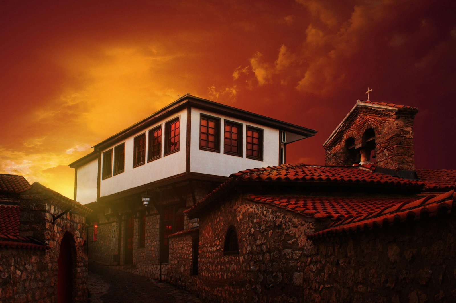
To understand the full impact of color in design, we need to look at its historical significance. Ancient civilizations were some of the first to experiment with color, not only for artistic expression but also for its symbolic meanings. The Egyptians, for example, used vibrant colors in their tombs and temples, with each hue having a particular significance, such as green for fertility and rebirth, or gold for the divine.
In the 19th century, industrialization and the invention of synthetic dyes revolutionized the use of color in design. Vibrant shades became more accessible, and designers began exploring new ways to incorporate color into architectural and interior spaces. Today, color plays an integral role in modern architecture, influencing not just the aesthetic but also the functionality and emotional impact of a space.
Understanding the Emotional Impact of Color
Color is much more than a visual experience—it has a profound psychological effect. Each color evokes certain emotions and responses, and the way we perceive color can vary depending on cultural background, personal experiences, and even lighting conditions.
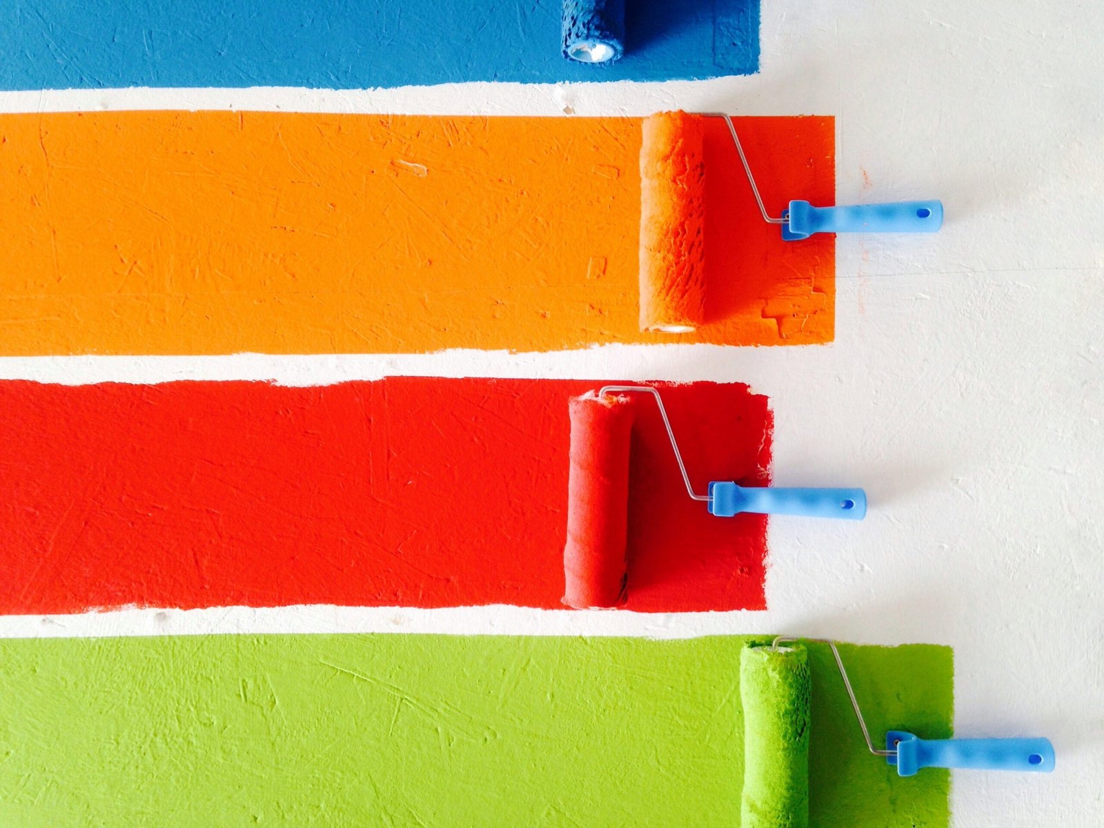
Green: Symbolizing nature, growth and balance, green has a calming effect on the mind and body. It is an excellent choice for living rooms, offices and rooms where relaxation or concentration is required. Lighter shades of green bring freshness and energy, while darker shades give a more stable and calming feeling.
Yellow: The color of sunshine and optimism, yellow is often associated with happiness, creativity, and energy. It is commonly used in kitchens, playrooms, and areas where social interaction occurs. However, too much yellow can cause feelings of anxiety or frustration, so it’s best used as an accent color.
Red: Often associated with passion, energy, and warmth, red can stimulate a sense of urgency and excitement. It is often used in dining rooms and kitchens, where it can increase appetite. However, overuse of red can create a feeling of tension or aggression, so it’s important to balance it with calmer tones.
Blue: Known for its calming and tranquil properties, blue is the color of trust, loyalty, and stability. It is commonly used in bedrooms and bathrooms to create a peaceful environment. Lighter blues can evoke a sense of serenity, while darker blues suggest sophistication and depth.
Purple: Often associated with luxury, royalty, and creativity, purple is a color that brings depth and drama to a space. It is commonly used in bedrooms or creative spaces to inspire imagination, but like red, it can be overwhelming if used excessively.
Orange: A vibrant, energetic color, orange is associated with enthusiasm and excitement. It is ideal for social spaces, like living rooms and home offices.
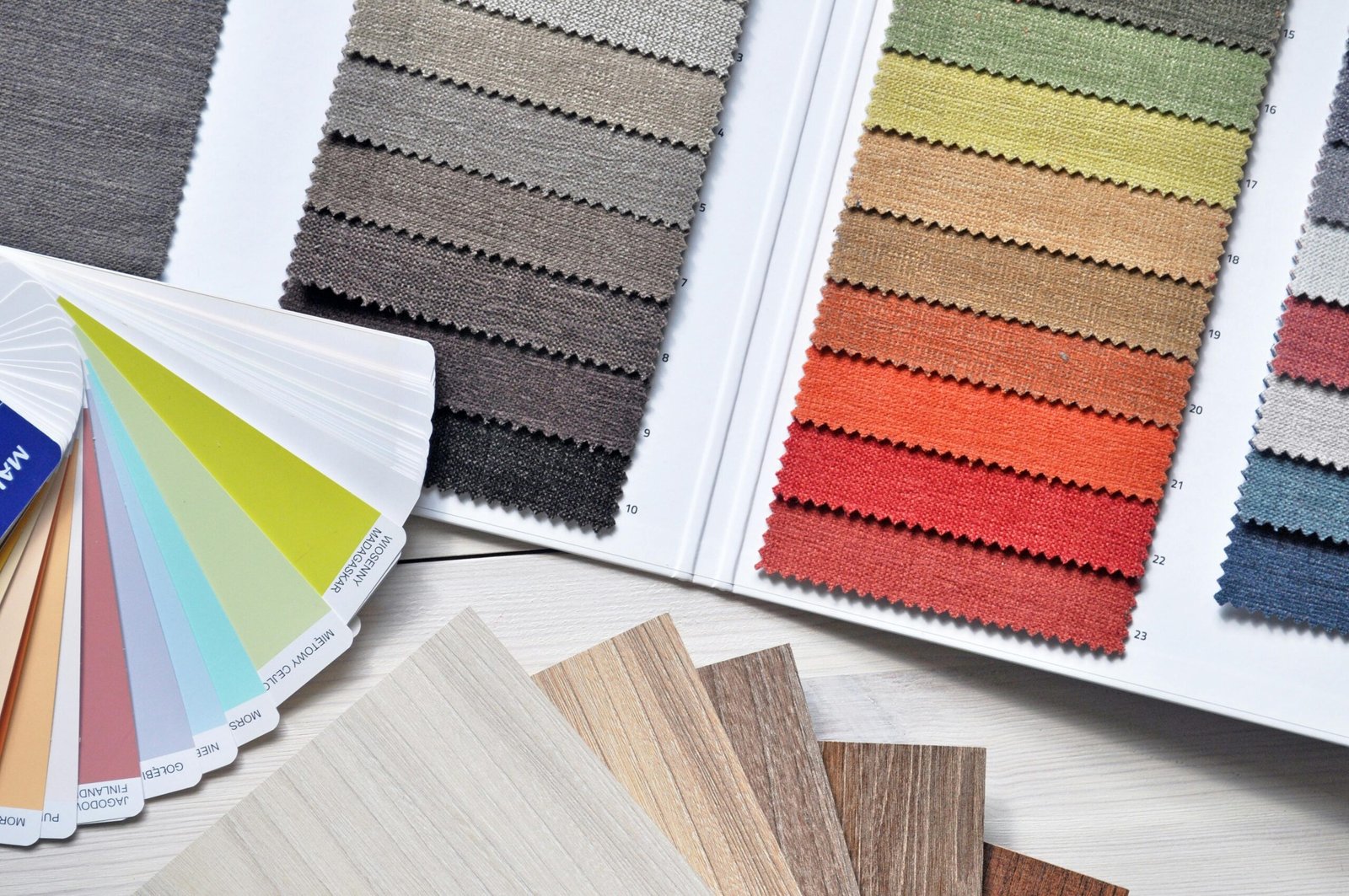
Neutral Tones: Neutrals like beige, gray, and white are versatile and timeless, often used to create a sense of balance and harmony. They act as a backdrop for other colors, providing a calm and neutral foundation. While these colors may not evoke strong emotions on their own, they help to enhance the impact of other hues in the space.
The Science Behind Color Perception
The way we perceive color can change depending on various factors, including lighting, surrounding colors, and the size of the space. The scientific field of color psychology examines how different wavelengths of light affect our perception and emotions. The lighting in a room can significantly alter the appearance of a color—warm lighting brings out the reds, oranges, and yellows, while cool lighting makes blues and greens appear more vibrant.
For instance, a white wall in natural daylight may look crisp and clean, but under fluorescent lights, it can take on a harsh, almost sterile feel. By understanding the way different types of lighting affect color perception, designers can ensure that colors appear as intended, creating the right ambiance and mood.
The Role of Color in Residential Interior Design
Color plays a vital role in creating spaces that are not only beautiful but also functional and comfortable. The psychology of color can help define the atmosphere of each room, making it feel either warm and inviting, cool and serene, or vibrant and energetic.
Living Rooms: As the heart of the home, the living room is often where family and friends gather. A combination of warm colors like orange and red can encourage social interaction, while cooler tones like blue and green can create a more relaxed environment for unwinding after a long day. Using neutral tones as a backdrop allows accent colors to pop without overwhelming the space.
Kitchens: The kitchen is another space where color has a strong impact. Warm colors like red, yellow, and orange are known to stimulate appetite and energy, making them perfect for a space where meals are prepared and enjoyed. On the other hand, cool tones can create a more calming atmosphere, which is why many modern kitchens incorporate stainless steel appliances and soft grays or blues.
Bedrooms: The bedroom is a place of rest and relaxation, so choosing calming colors like blue, green, and soft lavender can promote sleep and tranquility. Lighter shades of these colors create a sense of openness, while deeper shades can add warmth and coziness.
Bathrooms: Soft, cool tones like light blue and mint green create a relaxing, spa-like atmosphere. White and gray are also popular choices, as they contribute to a sense of calm and freshness.
Home Offices: For workspaces at home, colors like blue, green, and yellow are often used to promote focus, and productivity. These colors stimulate the mind without causing distraction. Bright yellows can energize a space, while soft greens help with concentration.
Color and Commercial Design
In commercial spaces, color plays a more strategic role. In retail environments, restaurants, and office spaces, designers use color to influence behavior and drive customer engagement. For example, research has shown that certain colors can stimulate buying behaviors, while others can calm anxious customers or clients.
Retail Spaces: Bright colors like red, yellow, and orange are often used in retail environments because they attract attention and evoke excitement, which encourages impulsive buying. Luxury stores, on the other hand, often use rich, deep colors like black, gold, and burgundy to convey exclusivity and sophistication.
Restaurants: In restaurants, the psychology of color influences the dining experience. Red and yellow are commonly used in fast food chains to encourage quick turnover and stimulate appetite. In contrast, upscale restaurants may use darker tones like deep green, brown, and gold to create a relaxed, intimate atmosphere that encourages diners to linger longer.
Office Spaces: In commercial offices, the goal is to create an environment that boosts productivity and enhances employee well-being. Cool colors like blue and green are often used to create a calm, focused atmosphere, while yellow can stimulate creativity and innovation. Neutral tones, such as gray and beige, can provide a professional backdrop without causing visual clutter.
Biophilic Design and Nature-Inspired Color Palettes
One of the most significant trends in modern architecture and interior design is biophilic design, which emphasizes a connection with nature. Color plays a key role in this movement, with designers choosing hues that reflect the natural world—greens, browns, blues, and soft earth tones. These colors evoke feelings of calm and tranquility, as they are closely associated with the outdoors.
Incorporating natural light, plants, and natural materials, such as wood and stone, into the design of a space further enhances the calming effect of nature-inspired colors. For example, a living room with large windows that overlook a garden can be complemented by soft green and brown tones, creating a seamless connection between the indoor and outdoor environments.
Conclusion
The psychology of color is a powerful tool that architects and interior designers can use to create spaces that are not only visually appealing but also emotionally and psychologically stimulating. Understanding how different colors influence our moods, behavior, and perceptions can help create spaces that are both functional and harmonious. Through careful selection and coordination of colors, designers can shape spaces that inspire creativity, bring harmony, and create a pleasant and calming atmosphere.